Module – Pro

Popover Block

A small pop-up box appears when the user clicks or hovers on an element. Popover direction and trigger event (click or hover) can be set on the editor. Make a beautiful popover with many design options.

Popover Block – Pro

  • 5+ Templates

  • Direction Top, Right, Bottom, and Left

  • Trigger on Click or Hover

  • Active Popover Content on Load by default

  • Popover Content X and Y Spacing

  • Popover Content Advanced Background

  • Popover Content Height

  • Popover Content Spacing with Margin and Padding

  • Popover Content Border

  • Popover Content Box Shadow

  • Popover Content Width

  • All Button options

  • Individual Elements options on Popover Content

Popover Block Demo

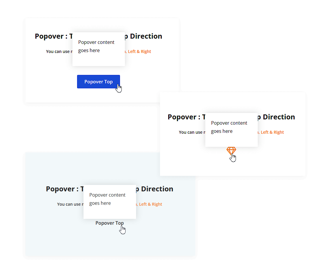
Popover: Template 1 – Top Direction

You can use more directions like Bottom, Left & Right

Popover content goes here

Popover: Template 2 – Right Direction

You can use more directions like Bottom, Left & Top

Popover Right

Popover content goes here

Popover: Template 3 – Bottom Direction

You can use more directions like Top, Left & Right

Popover content goes here

Popover: Template 4 – Left Direction

You can use more directions like Bottom, Top & Right

Popover content goes here

View All Designs

Build unique websites with our creative tool. Impressive design, powerful features, and easy customization